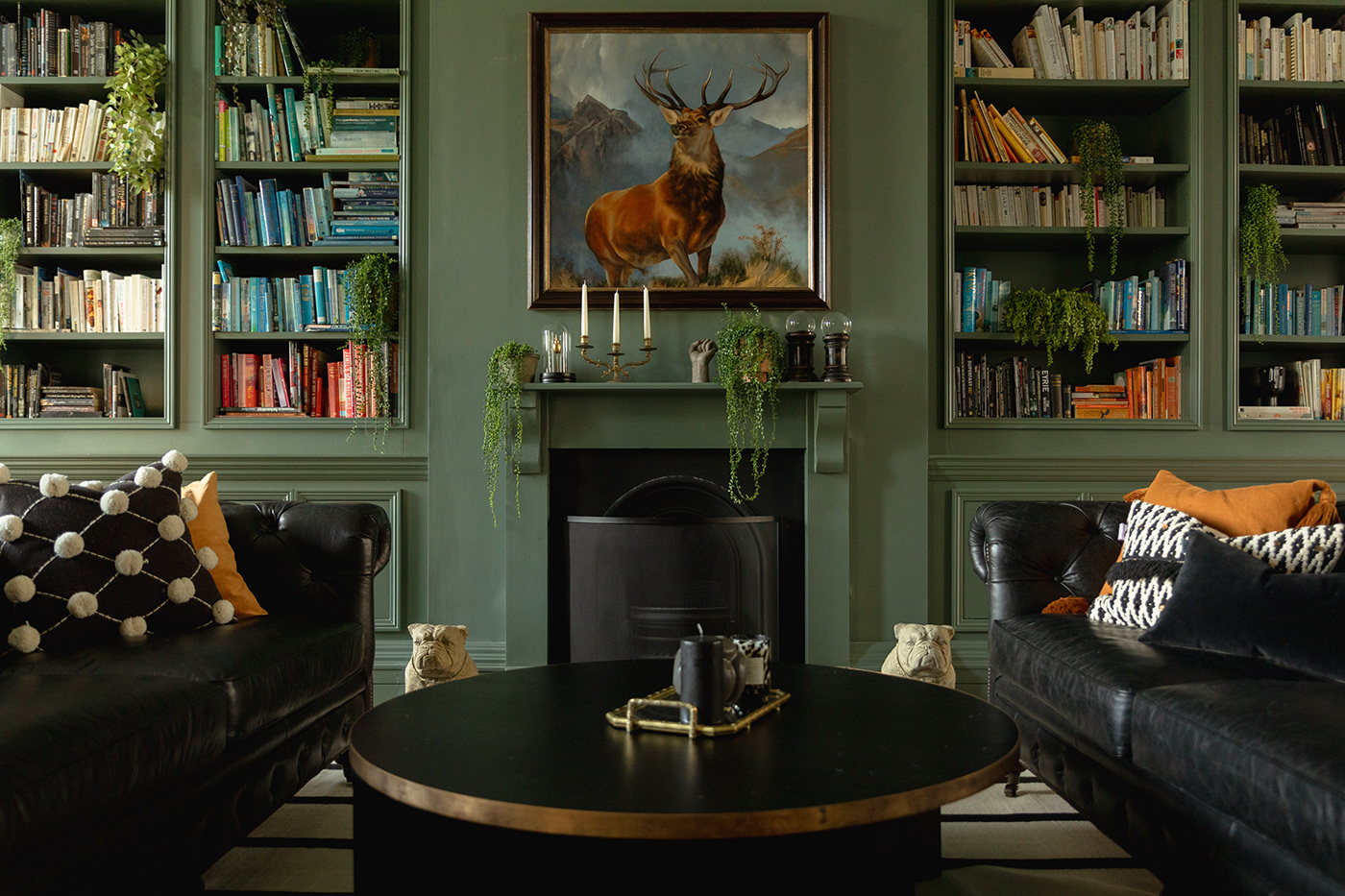
Kindred is an open house for West London — a space to gather for coworking, live events, and exceptional food and drink. The Run For The Hills interiors team had been working with Kindred for a few years, and finally the branding team were invited to complete the design circle and refresh the brand.

IT ALL STARTS WITH A LITTLE FIRE
The renewed visual identity blends heritage with a passion for building community and real-life human connection. Central to Kindred's brand ID is their campfire logomark - inspired by the openness and warmth created by gathering around a campfire. We went through many iterations of the mark, honing and tweaking it to perfection....

Then we created a pattern from the logs...


ILLUSTRATIONS
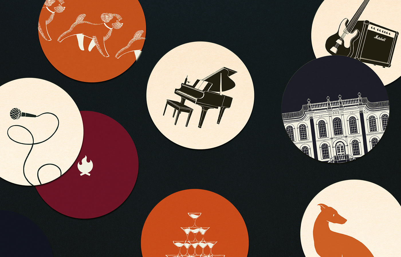
We then built out Kindred's brand world by way of a library of stylish illustrations that help bring to life all the things that make Kindred so special. A grand piano, branded drum kit and microphone on a looping cord to represent Kindred’s dynamic roster of live music events. Notebooks, coffee cups and canines to represent the venue’s dog-friendly membership co-working spaces. And a rich collection of food and drink-inspired illustrations showcasing Kindred’s fantastic F&B offering.
Look out for posters and other printed materials dotted around in poster frames and printed leaflets if you ever go visiting Kindred.


VIP GUESTS
Here are a series of furry friends who are always welcome at Kindred.


Kindred founder Anna Anderson's dog, Chutney, is featured on Kindred's loyalty cards.
Collect 6 campfires for a free cocktail of your choice!


WELCOME TO THE CAMPFIRE
Kindred HQ is a stunning building in Hammersmith, bringing some magic to the roundabout. Its facade is a stunning example of English Baroque style, and it was a pleasure to illustrate it.
You can find it on the billfolds when paying for your order and on Bingo Mount Cards.


MENUS
Litho printed on a lovely rough paper so you don’t want to let them go...


DRINKS BOOK
The centrepiece of all the brand work was a hardcover 40-page drinks book. The beautiful tome, with a tan-orange cover featuring an understated campfire emboss, is printed on subtly textured Fedrigoni paper with matching orange stitching. It really is a piece of storytelling in its own right, with a narrative talking about the provenance of everything Kindred does, championing Kindred’s independent London suppliers — all artisans and family businesses. The tone of voice is whimsically descriptive and full of our illustrations which take the reader on a journey through the makers who pour their passion into their very special products.


SOCIAL MEDIA ASSETS
Having such a wide range of brand assets it was really fun to put them together for social media layouts. We created a handover pack for the Kindred team to run with, creating their own Instagram content to showcase the exciting events that are coming up.

CREDITS
Lead Designer & Brand Photography: Sonya Lyakhova
Creative Director: Chris Trotman
Animation: Daisy Watson
Interior Photography: Valentino Blas


